Continuity, focus, perspective: new logo for Goodgame Studios
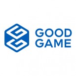
As you’ve already read in many of our blog posts, this year we’ve kicked off and implemented lots of structural changes at Goodgame Studios! A key element of this are our new studios, which will develop many innovative games in the future. And now we bring you the next big news! We’ve spent the last two months developing a new logo for Goodgame Studios, which helps us present the company’s development visible externally! We’re excited to present to you our new logo for the very first time:
Our new logo deliberately no longer includes the word “Studios”, although we will still be known as Goodgame Studios. The reason we shortened the name in the logo is because we want everyone who sees our logo to immediately recognize what we stand for: great games! This is also why we stacked the text. By making the logo easier to read, we hope to enhance the significance of each word. Furthermore, we developed our own variant from the Century Gothic and prepared it for future applications. It conveys a timeless clarity and therefore goes well with our vision of building up a company with long-term success.
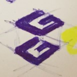
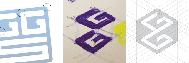
The image’s most significant novelty is of course its spatial first impression. At first sight, the viewer gets the impression that the two G’s are sitting on top of each other in a three-dimensional space. We’ve incorporated this effect to underline the complexity of our business model. Our complexity can be seen in the plans of our individual studios as they work on developing new and different games for you to play in the future, from fun puzzle games to captivating game titles for the core gamers among you. The two G’s, which stand for “Good” and “Games”, also dominate the new logo and help draw attention to our clear focus on developing good products. As the logo is not beveled, it now looks much calmer, more relaxed, and more grown up.
In terms of the colour scheme, we have remained true to the proceeding logo to a large extent. The colour blue stands for a trustworthy and innovative technology company, and the bright shade stands for a friendly lightness, which is very fitting for a gaming company.
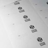
Besides, the development process also involved some pragmatic considerations. The logo is better suited for all branding activities thanks to its more compact design, and it enables us to create further logos for our individual studios. It was also our objective to have an umbrella brand under which each of the studios can be positioned with their own logos.

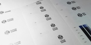
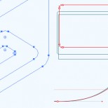
As you can see, developing a new logo is a very complex procedure, and hence experts from various departments have been involved. Our Corporate Art department played a significant role in creating the logo, specifically Alexander Wende, who was in charge of the figurative mark, and font designer Nicolai Gogoll, who took care of further developing the script. Also involved was our corporate communications team as well as the Management, who made sure that the logo is in line with our corporate identity. Last but not least, our localisation and user experience teams ensured that the logo would be understood in the same way all over the world.

